Laura Berman has been apart of the Olson-Larsen artist family since late 2017 and since then, we have received countless comments on her joyful and bold use of color! Whether it’s her layered monoprints, hand painted or collaged elements; we always look forward to every new batch of work Laura sends our way.
We asked Laura some questions about her relationship with color and a recent commission project for an O-L client.
Olson-Larsen Galleries: What role does color play in your life– both in daily life and your artistic practice? Does one inform the other?
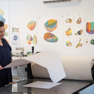
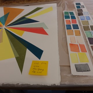
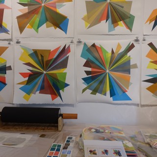
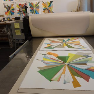
Laura Berman: My daily life holds mostly subdued colors, with some strong, solid colors anchoring my surroundings. We live under a tremendous 200+ year old oak tree, and the light shifts around the tree and its leaves during the day, simultaneously shifting the colors around inside our home. The most colorful things I live with are in my kitchen and in my closet. My interactions with color are very intuitive, whether I’m choosing what to cook or what to wear. Either way, I find that the colors I choose to engage with are something I need in that moment or day, for instance, I’m known to have random cravings of richly-toned foods such as carrots, beets and kale. I’m also known to always print the color I’m wearing that day, so I’m careful to choose my clothing wisely on studio days. Today I plan to print new layers on the very colorful “Starburst” print series, using at least 11 different colors, so I am wearing a rainbow-striped dress
OLG: You recently partnered with Speedball Art demonstrating the various ways you use color both in theory and in practice. Walk us through that process a little, did anything surprise you or did you learn anything new about your work or studio habits?
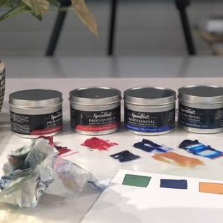
LB: Last March, Speedball Art asked me to contribute their new “Create in Place” program. We decided to work with the idea of how I approach color in my work. I recently developed a class called “Color Printmaking” at Kansas City Art Institute, which explores ideas and techniques of using color. For this class I have read dozens of books about color theory and the history of color as a material. Something that has really inspired me as a teacher and as an artist is the idea that color can be both an idea and also a thing. Color defies definition––does it live in our minds or in our world? Does it reflect or does it absorb? Is it excessive, is it elusive? What does color really mean, anyway?
I asked the Speedball Art audience to request colors to mix, and I ended up with 24 different requests for colors. I mixed all of these colors in one marathon inking session, which took about an hour to do, but many hours to set up, document and edit into a color-mixing video. I created each color from my own idea about it––to me, “Minnesota Lake Water” was a grayish-blue and solid-looking color, and “very evil yellow” was an unnatural greenish-yellow color that glowed like neon. One funny thing I learned is that my husband and I do not see colors the same way. He requested “Purportedly Prepared Puce (with a tinge of regret)” and did not agree with my interpretation of this color, haha


OLG: We have been coordinating with you this spring and summer on a client commission. In this case, the client gravitated toward a particular series of yours, but wanted to offer some direction in the colors you used. Can you speak about how you typically navigate commissions? Is it ever challenging to execute your original vision for the work while still adhering to the client’s wishes?
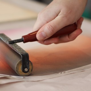
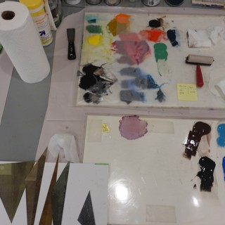
LB: I enjoy commission projects very much, as each is a unique design challenge to solve. Working newly through imagery I have used before is calming as well as challenging. Once I have created a series of prints with any given image motif and scale of shape, I know certain strategies of building the image that work and do not work, so that part is always fun to repeat in new ways. An analogy would be playing a song on the piano that you have played many times––each time is slightly different while each time also keeps a similar rhythm and melody going. But there is always the chance for a slip-up or improvisation along the way too, which is the challenging part for me. Each step of my printing process is a place where I can make a choice–-what color to use, what placement within the composition to go with, is this part of the print done, or does it need to grow more? Finding the sweet spot of intrigue and specificity within each image I make is the goal, but that line can be crossed. If I do mess up a print, then it becomes the perfect material for my collages.

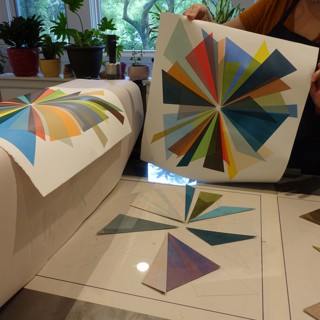
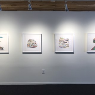
OLG: We have several of your latest works in our Annual Landscape Show: Parallels on view through July 25th, 2020. When thinking about what the traditional definition of landscape art is and then pushing it to what it could encompass, we felt that your work fit like a glove. What landscape elements are you inspired by and see recurring thematically in your work?
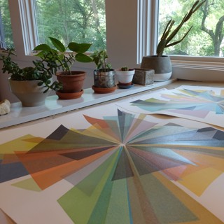
LB: I love that my work is included in the Annual Landscape Show. The relationship of the sky to the earth is a huge influence on my work. This is a dynamic and timeless relationship, where shifts constantly occur in small and quick ways, as well as in large and slow ways. My process of working reflects this idea of continual rebuilding and recreation. As I work through a series of images, I am slowly adding or removing colors, realigning compositions, and playing with the space within each print. My work is often abstract in form, yet the concept of distance greatly informs each image I create. I am often thinking of how color informs space, in a way that describes dimensional form. Relating this back to a landscape, the colors when viewing a great vista are most dilute at the furthest distance away (unless the sun is approaching the horizon). How we psychologically understand distance within colors, and the relationships of colors together, is something I think about often.